

Straightaway Fence Co. is a premier fence company in Metro Detroit dedicated to installing top-of-the-line fences that withstand the toughest storms. They’re committed to providing top-notch customer service that homeowners jump to refer, and their client reviews are here to prove it.

Straightaway Fence Co. is a premier fence company in Metro Detroit dedicated to installing top-of-the-line fences that withstand the toughest storms. They’re committed to providing top-notch customer service that homeowners jump to refer, and their client reviews are here to prove it.

LUXE WEB DESIGN + BRANDING
THE CHALLANGE
Straightaway Fence Co. (SFC) came to me with a strong reputation offline, with little to support it online. Their logo needed a modern refresh, their brand lacked visual consistency, and they had no digital home to showcase their craftsmanship or attract the right clientele. Without a cohesive brand identity or a strategic website, they were relying solely on word of mouth, leaving growth on the table and limiting their ability to build trust at scale.
THE SOLUTION
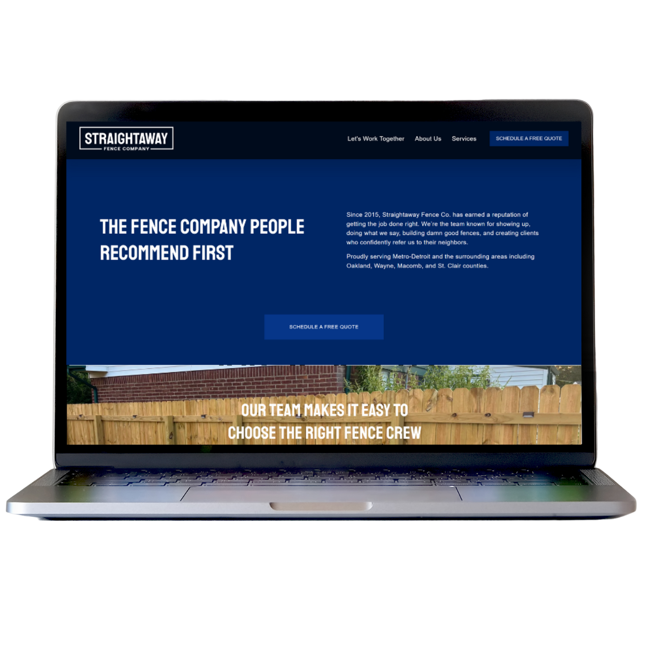
I guided SFC through a comprehensive brand transformation, beginning with refining their logo and establishing a cohesive visual identity that conveyed a clean and trustworthy image. From there, I designed a strategic Squarespace website built to highlight their services, showcase their project work, and position them as the reliable, skilled fencing company they are.
To support their marketing, I created custom graphics they use on work sites and across platforms, giving them a unified, professional presence that builds credibility, boosts visibility, and helps convert viewers into inquiries.
DESIGN NOTES
-
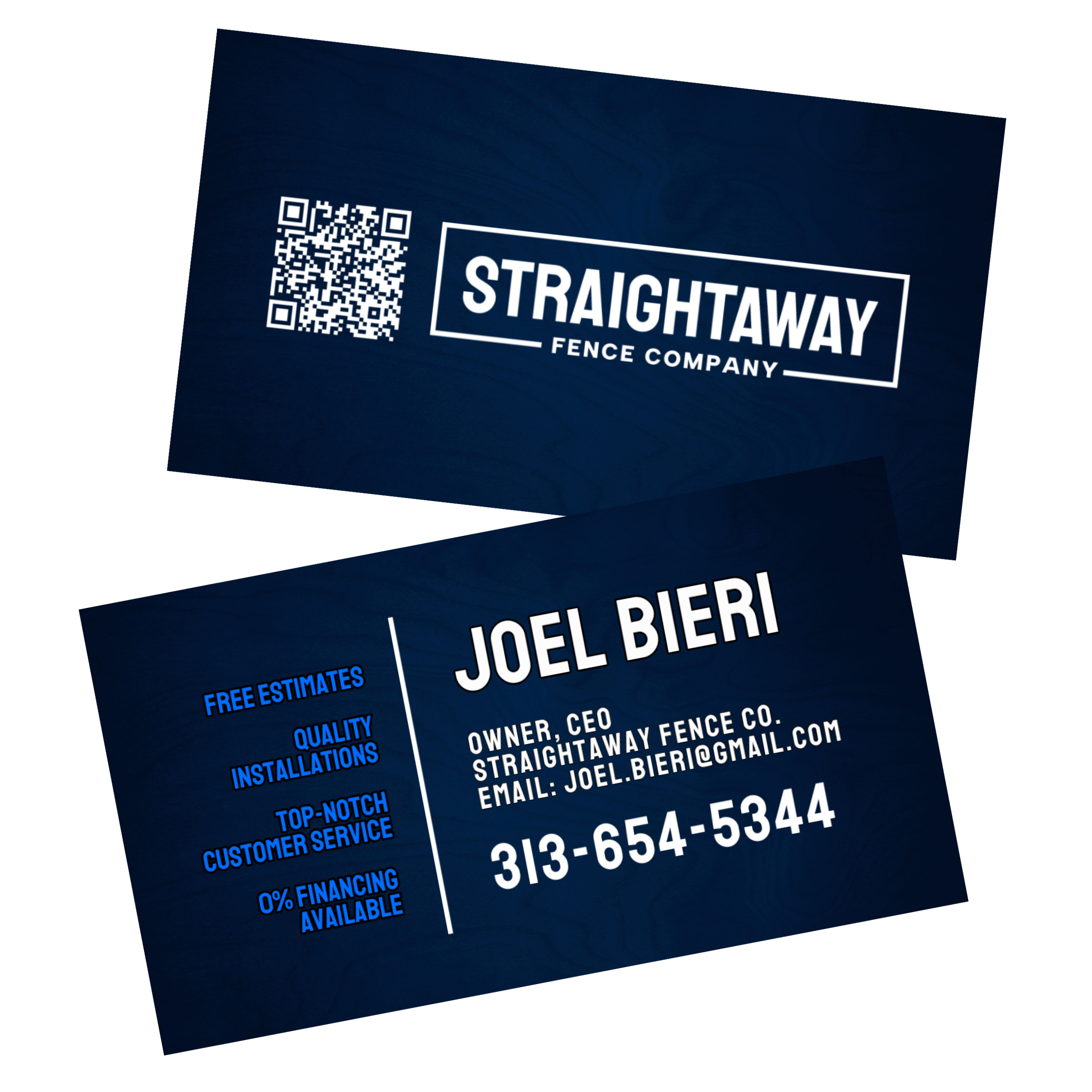
Straightaway’s previous logo was extremely outdated and disproportional. The new logo was intentionally designed to look sleek and simple, communicating professionalism, vigor, and reliability. The clean lines and balanced proportions offer the brand a stronger, more recognizable visual identity that aligns with their business name “Straightaway”.
-
For readability and a confident aesthetic, the brand uses Staatliches for bold, eye-catching headers and Helvetica Neue for clean, approachable body copy.
For select callouts and to give more “masculine notes,” I incorporated subtle touches of Permanent Marker font, adding personality without compromising cohesion. -
Straightaway’s palette blends a range of strong, trustworthy blues: cobalt, royal, and deep navy tones. These hues anchor the brand in dependability and longevity while complementing the natural, earthy colors found in fencing materials and outdoor environments.
-
All imagery is sourced from the client’s original fencing projects to showcase real craftsmanship and authenticity. The photos highlight texture, structure, and quality, reinforcing credibility and giving potential customers a clear sense of the work they can expect.
-
To unify the brand across touchpoints, I created a suite of cohesive marketing pieces including an A-frame sign, yard sign, business cards, and marketing flyers. Each design ties back to the refreshed visual identity, ensuring the brand feels consistent, recognizable, and professional whether seen online or out in the field.

Deliverables


Squarespace Website + Copywriting
Modern Logo (SVG + PNG Format)
Business Card Design
Yard Sign Design
A-frame Sign Design
Flyer Design
Ready for your Next-Level?
If you’ve envisioned your website coming to life aligned, credible, and built to convert, I’m ready to make it happen when you are.